INTERVIEW WITH ARTIST ERIN PATA

I met Erin several years ago, just as I was settling down and having children. From the moment I met her I was inspired by her creative spirit, her relaxed child rearing and contagious need to speak what was on her mind. Her art and design evoke images from the past, with a clean and fresh feel. I love the simple yet detailed, hand done imagery she brings to life. So when WHS was in need of a logo, we knew just who to turn to. Seeing Erin's process from the conceptual to screen printing aprons, letter pressing note cards and having our perfect logo for the launch of our website was so charming we wanted to share it with you all. Read her interview and watch the video below!
WHS: When did you realize your love for creativity and design?
Erin Pata: My mom tells the story of me being the little girl in the grocery store check-out line and she could visually see my fingers twitching, not for the candy, but for the brand new box of crayons sitting there on the shelf. I was the kid always drawing and creating things... the family christmas card, my halloween costumes, and once I learned to use the sewing machine I started modifying my clothes in high school since my mom wouldn’t buy the stuff I wanted. What’s interesting is that both my sisters were singled out and put in the advanced art classes. Not me. But I am the only one who has ended up doing anything in the creative fields. It just goes to show you it’s not about talent. It’s about passion. Passion is the most enduring kind of fuel.
WHS: What or who inspires your design?
EP: Right after my first baby girl I got this insatiable urge to turn my attention into making things for her. I happened upon a fabric designer who turned out to be from my tiny home town in Ohio (population 10,000) who was revolutionizing the stale, cutsie-pie, cotton print quilt world of ducks and cows in the early 2000’s. She was reinventing the overused farm animal and country checkered cotton prints and turning them into uniquely colored, bohemian, modern designs and patterns. As a graphic designer who is visually oriented to the world, her fabrics caught my attention and pulled me back into the creative bliss swing. Her name is Amy Butler and the fact that she lived in a house that I had played in as a child made it even more serendipitous to me. I made everything I could make. I sewed baby blankets, diaper bags, dresses, pants, backpacks, curtains and even started reupholstering my furniture. I finally made too many things so I had to start selling them to justify buying the next season’s line of fabric.
WHS: When did you realize your creativity could be turned into a business?
EP: My creativity felt a little manic and had already expanded out of print design in to the world of sewing and building. I got to the point where I could no longer use or gift what I was making so I decided to start selling my goods. It was fabulous time in my life. I had a baby on my back at the sewing machine. I didn’t care about the money as much as pairing interesting fabrics and designs together to make something. As life with three babies started to settle in I found those precious two hours to myself everyday during nap time to be a time I could experience that creative bliss and even start to make a little money on the side.
WHS: Tell us about Butterbean Studios...
EP: Butterbean Studio’s tagline is Where Art and Farming Collide. Pata Bros. Farming and Ranching has been continuously owned and operated by a single family for over a century. In 1912, Candido Pata, a Swiss immigrant, started with a twenty acres near Lompoc, California. Through the 1900's he and his two boys raised cattle and butterbeans. Now more than 100 years later, his two grandsons continue to work the family plot together and grow a variety of dry-land farmed beans. Although the machinery may have evolved a bit, not much else has changed.
I am a graphic designer. Half of my time is still spent with graphic design clients. I design logos, invitations, posters, brochures. The rest of my time is spent branding his goods (beans, honey, cattle… seriously, I actually do brand the cattle in the spring), packaging and shipping his goods to people and stores across the country. His time is spent out in the fields growing thing and tending to the cattle. But sometimes he sorts beans and sometimes I tend to the cattle. The packaging is designed, produced and marketed by me, the farmer's wife, and the bags are filled by the kids to earn some spending money. It is truly a family business.


WHS: When and how did you get into letter pressing and screen printing?
EP: Forever interested in cutting out the middle-man, learning how things work and living far from town, I have developed a strategy to just do everything myself and never need another human being for anything. It’s the apocalypse-prepper side of me. So the next logical step after designing something yourself is to print it yourself. I looked online for a few months and finally found the press I was looking for up in Santa Cruz. The man was a teacher selling off his extra presses so he gave me a deal, a half hour lesson and sent me home with a bag of ink and tools. I have since supplemented my letterpress education myself with Youtube videos and a healthy dose of not waiting for things to be perfect before jumping into it. I am content learning as I go.
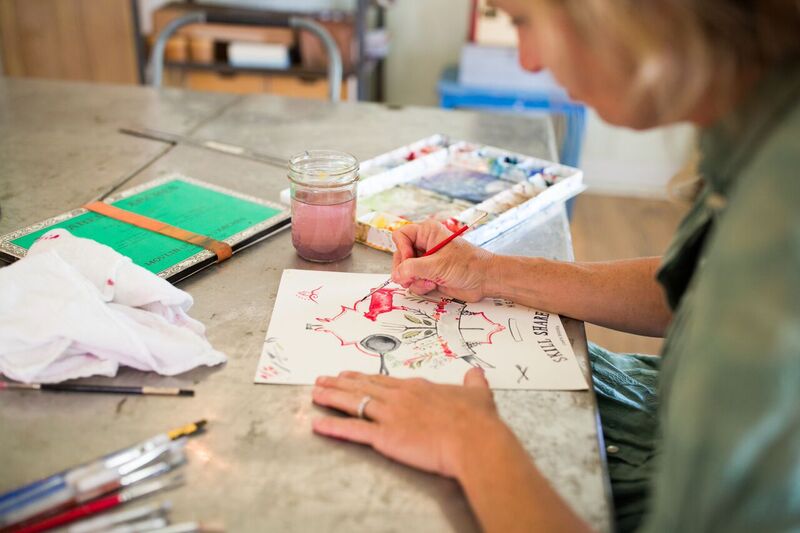
WHS: We adore our logo! Can you tell us about your process in designing it?
EP: It starts with a sketch. I still use paper and pencil to get some broad ideas out and get the client’s approval on the direction. Lauren and I discussed the concept together and the three areas that the logo needed to communicate… Food and Drink, Plants and Herbalism, and Animal Husbandry. We came up with an illustration of a cast iron pan, various plants and a cow as the main representational elements. I threw in a couple other iconic homesteader type tools like a pitchfork and an ax (thanks for letting me keep the ax next to the cow). Then, once the sketch is settled I get out the art supplies that I’ve collected since my childhood, the paper I picked up in Switzerland, the tools I’ve inherited from family, and get into the zone to bliss out the artwork. In your case, we decided it was going to be a brightly colored watercolor which leaves little room for mistakes or changes. But that’s okay because we have the computer. I scan the image and take it into Photoshop to make the text slightly bigger or to move the cow over a little. I can even mess with the colors. You guys were a very easy client. I think we got that logo done in 3 days. Sometimes that’s better than having too much time to mull on it.

For more about Erin, her design and to check out her store go to www.butterbeanstudios.com and follow her on instagram @butterbeanstudios
Love, Lauren

Photos by Lauren Ross